


HARD Music Festival
Hard Music Festival is the largest and most varied venue for enjoying electronic music in Los Angeles. The multi-day event offers a broad mix of stages showcasing many types of electronic music.
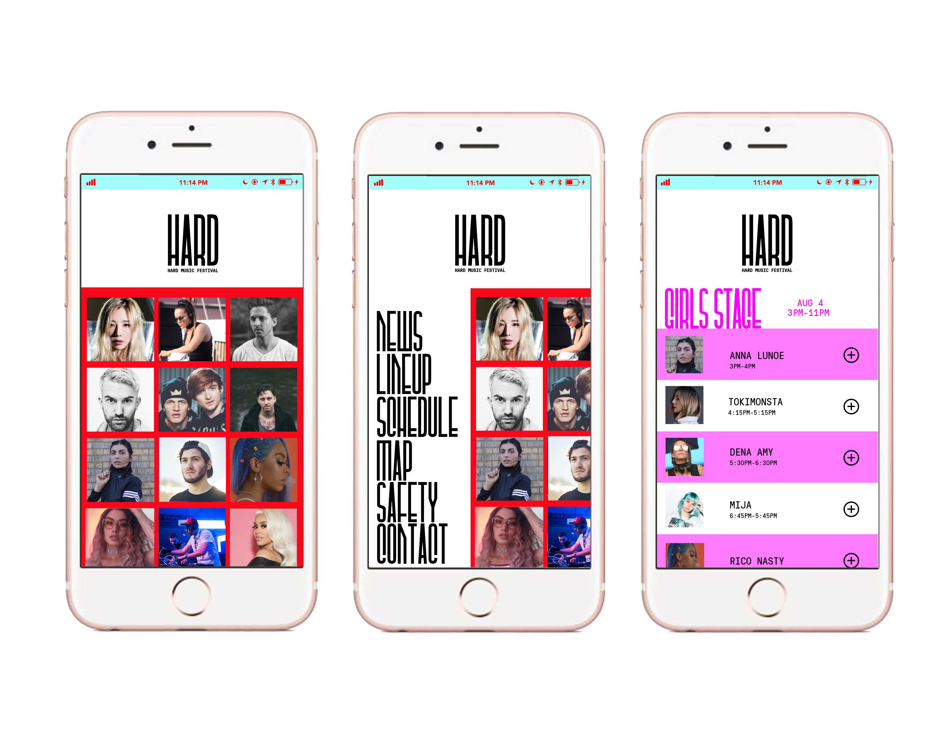
You can explore this new brand identity which is dynamic, musical and spatial. The graphic animation and colors are controlled by a music and sound input and are in this way responsive to the always changing festival environment.
Hard Music Festival is the largest and most varied venue for enjoying electronic music in Los Angeles. The multi-day event offers a broad mix of stages showcasing many types of electronic music.
You can explore this new brand identity which is dynamic, musical and spatial. The graphic animation and colors are controlled by a music and sound input and are in this way responsive to the always changing festival environment.
Categories
Brand Identity
Interactive Spacial Design
Instructors
Brad Bartlett
Miles Mazzie
Ivan Cruz
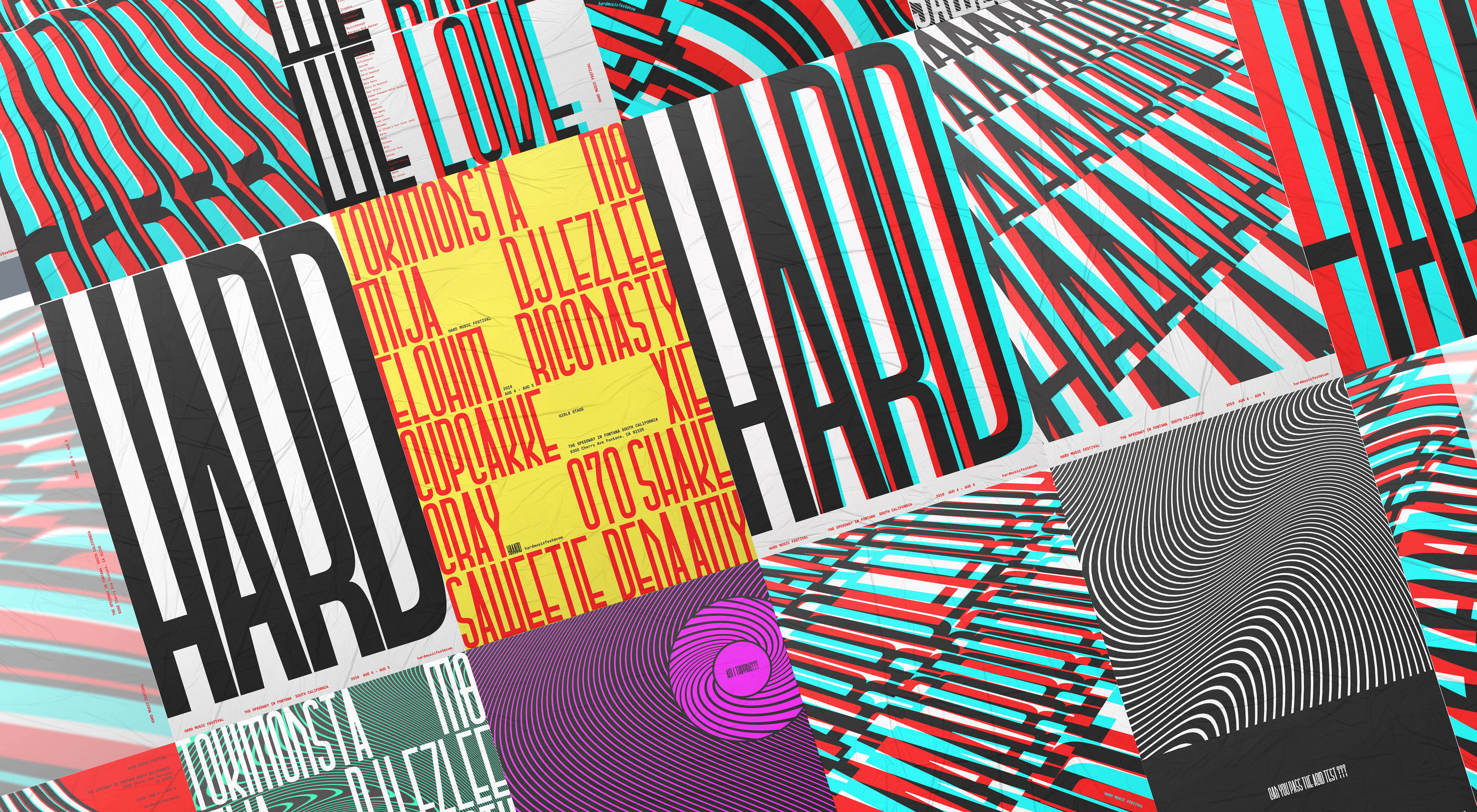
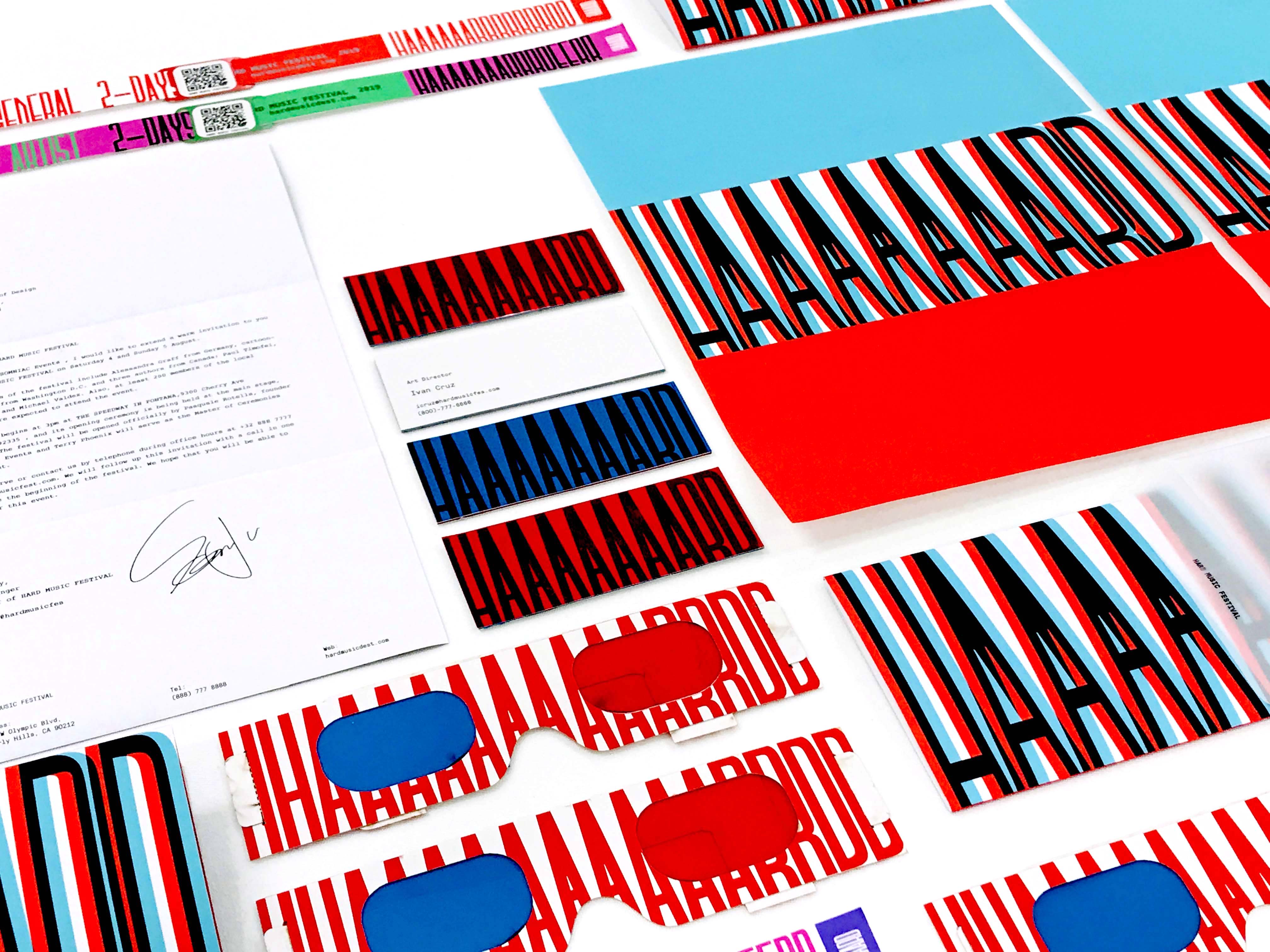
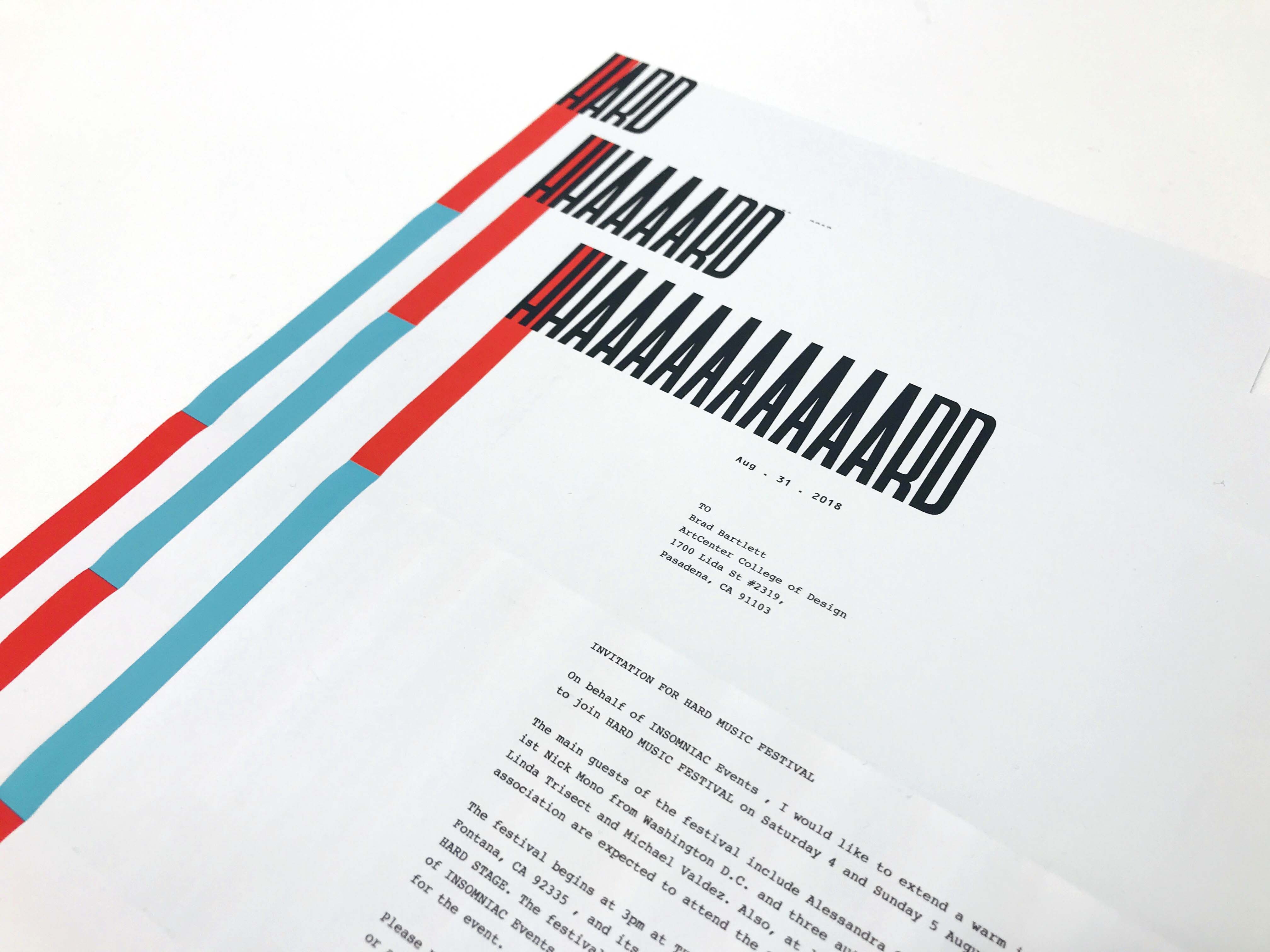
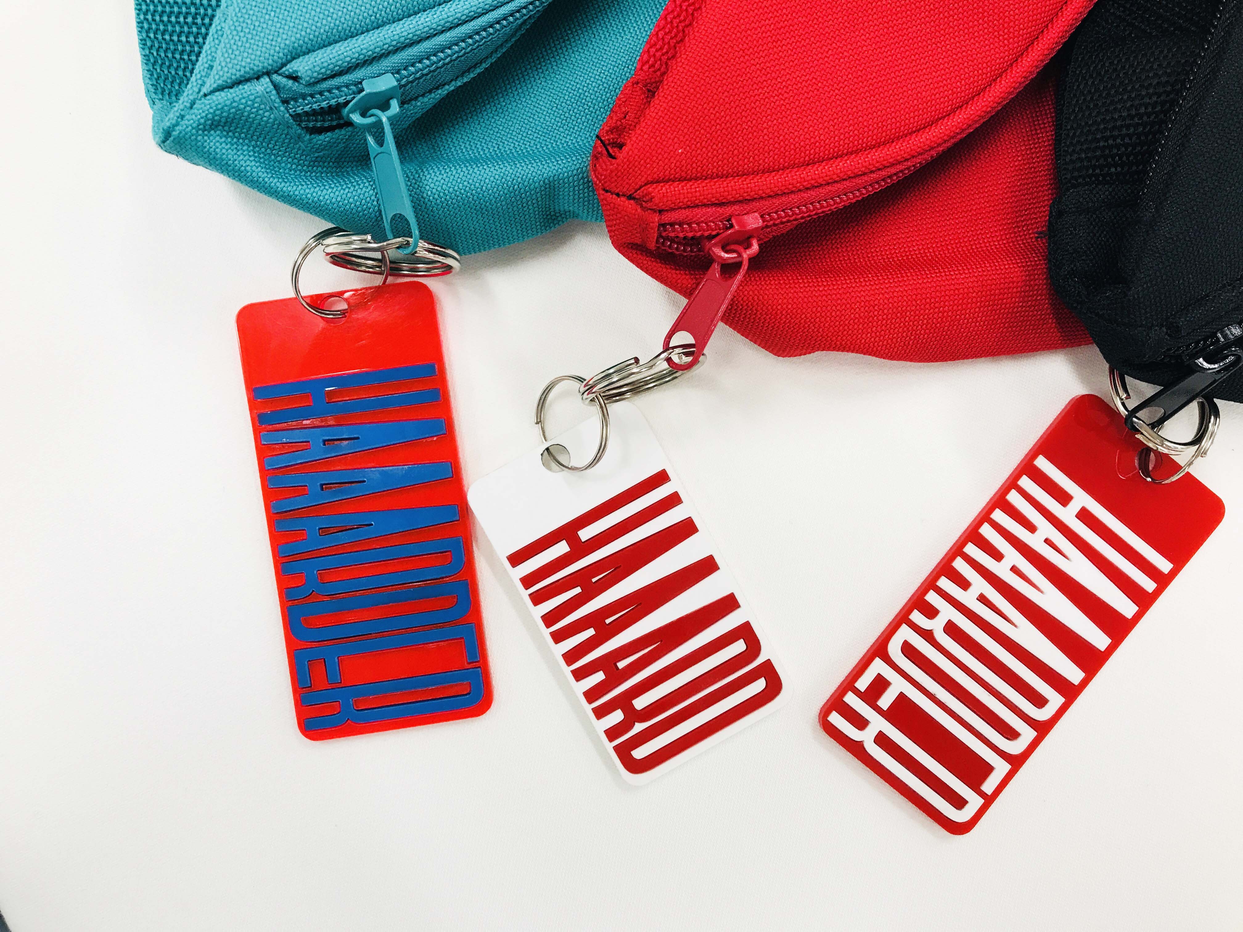
HARD Font DevelopmentThe logotype, which was inspired by the gesture of music and sound wave movement. Through applying their gesture, the logotype communicate its spirit and its experience with you on any media you would encounter.
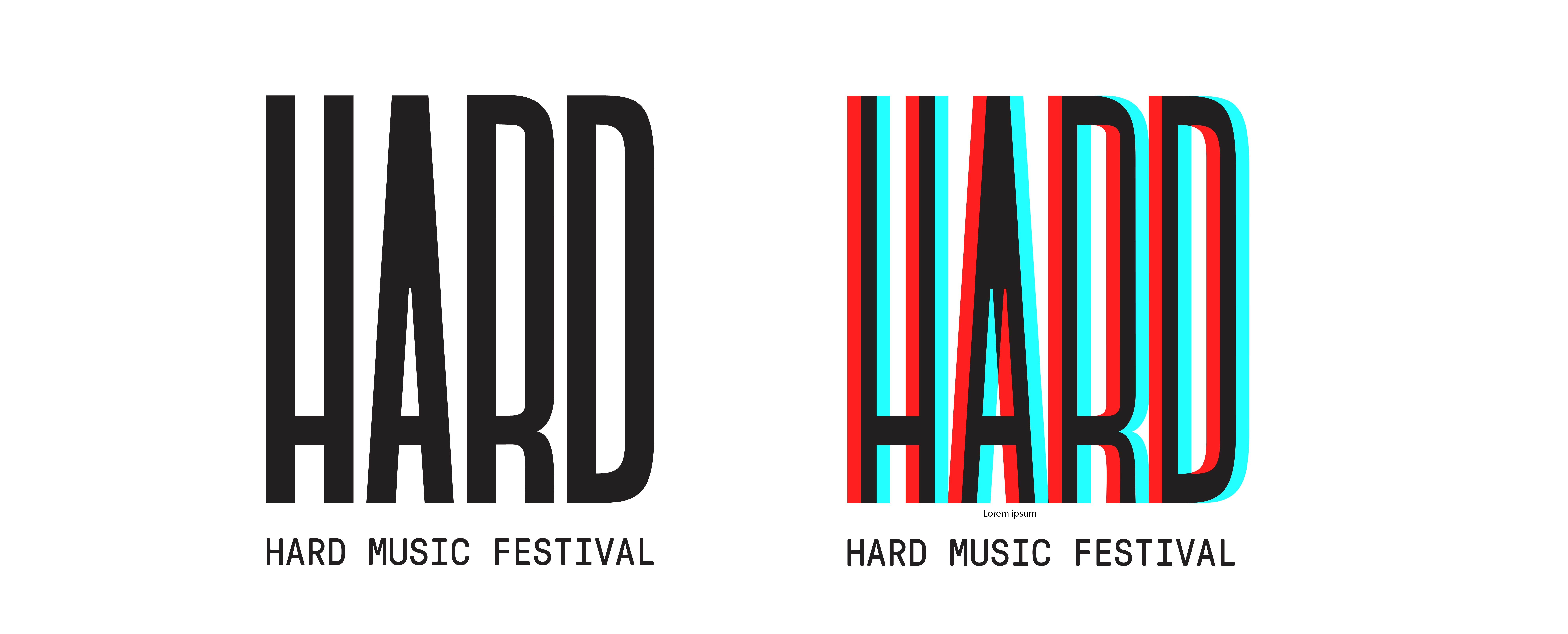
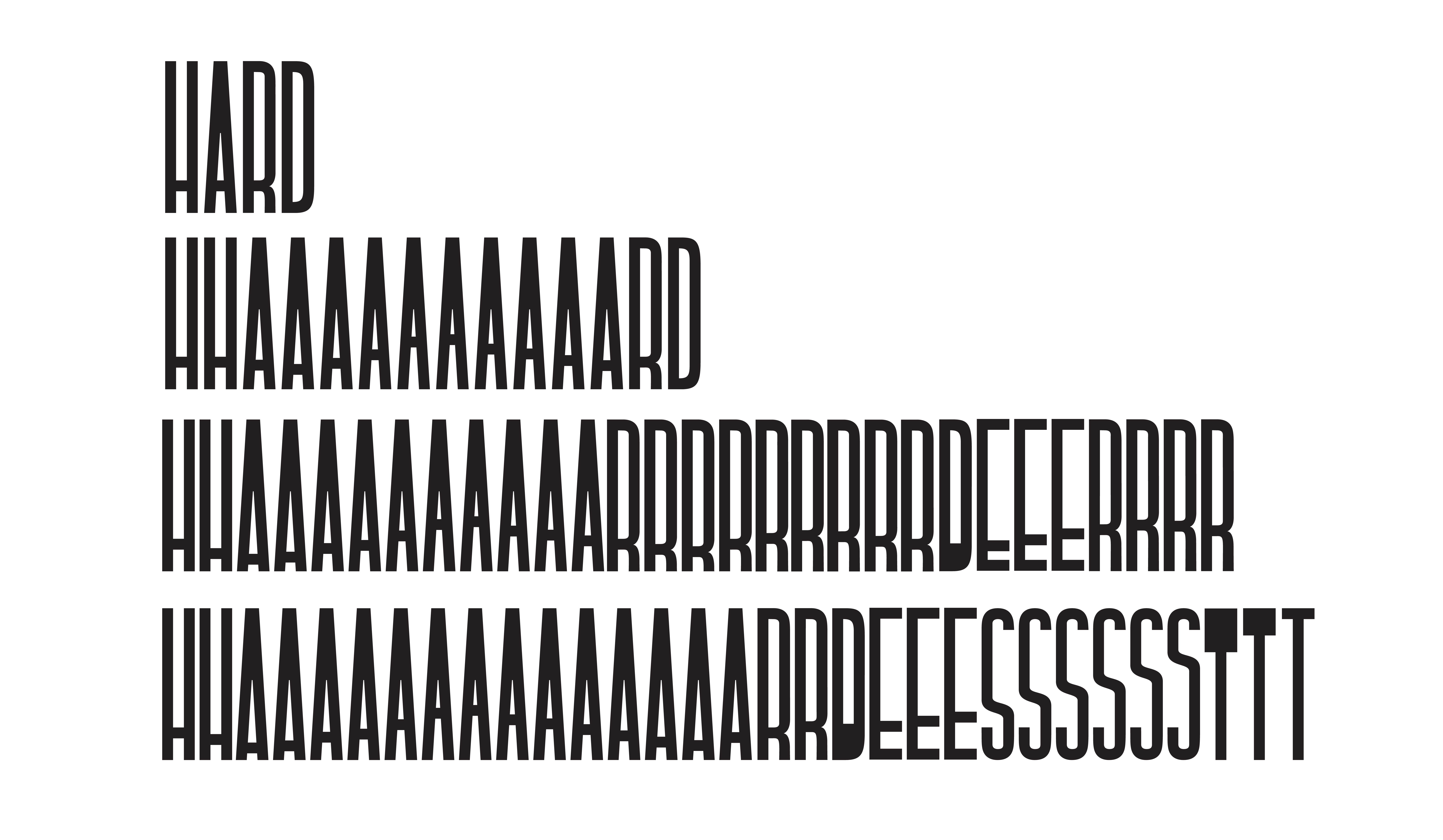
HARD Font (Custom Font)
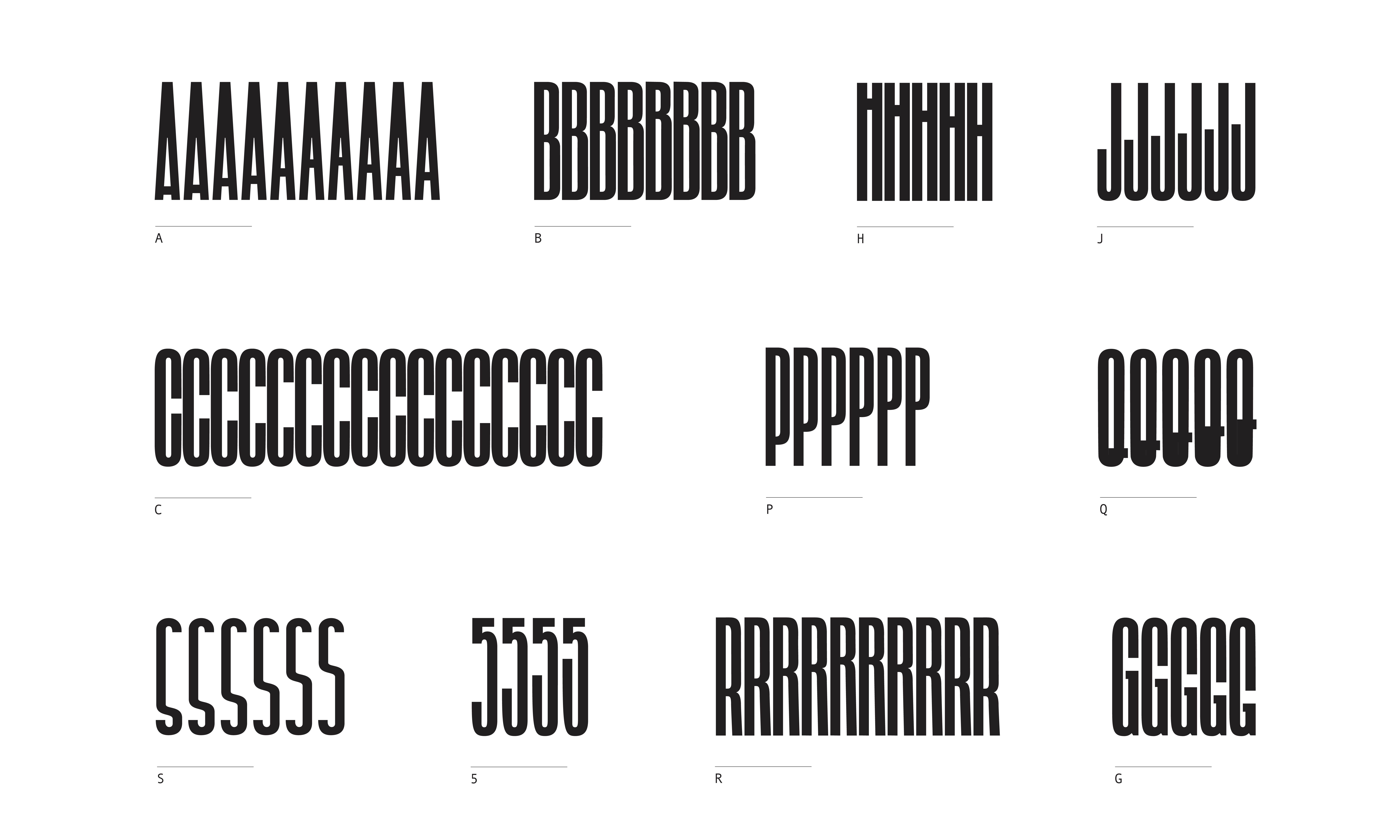
The custom HARD Font was designed to be responsive to a dynamic and rhythmic sound environment. The X-height and color of each character is continually modified by changes in music volume and tone.
The custom HARD Font was designed to be responsive to a dynamic and rhythmic sound environment. The X-height and color of each character is continually modified by changes in music volume and tone.

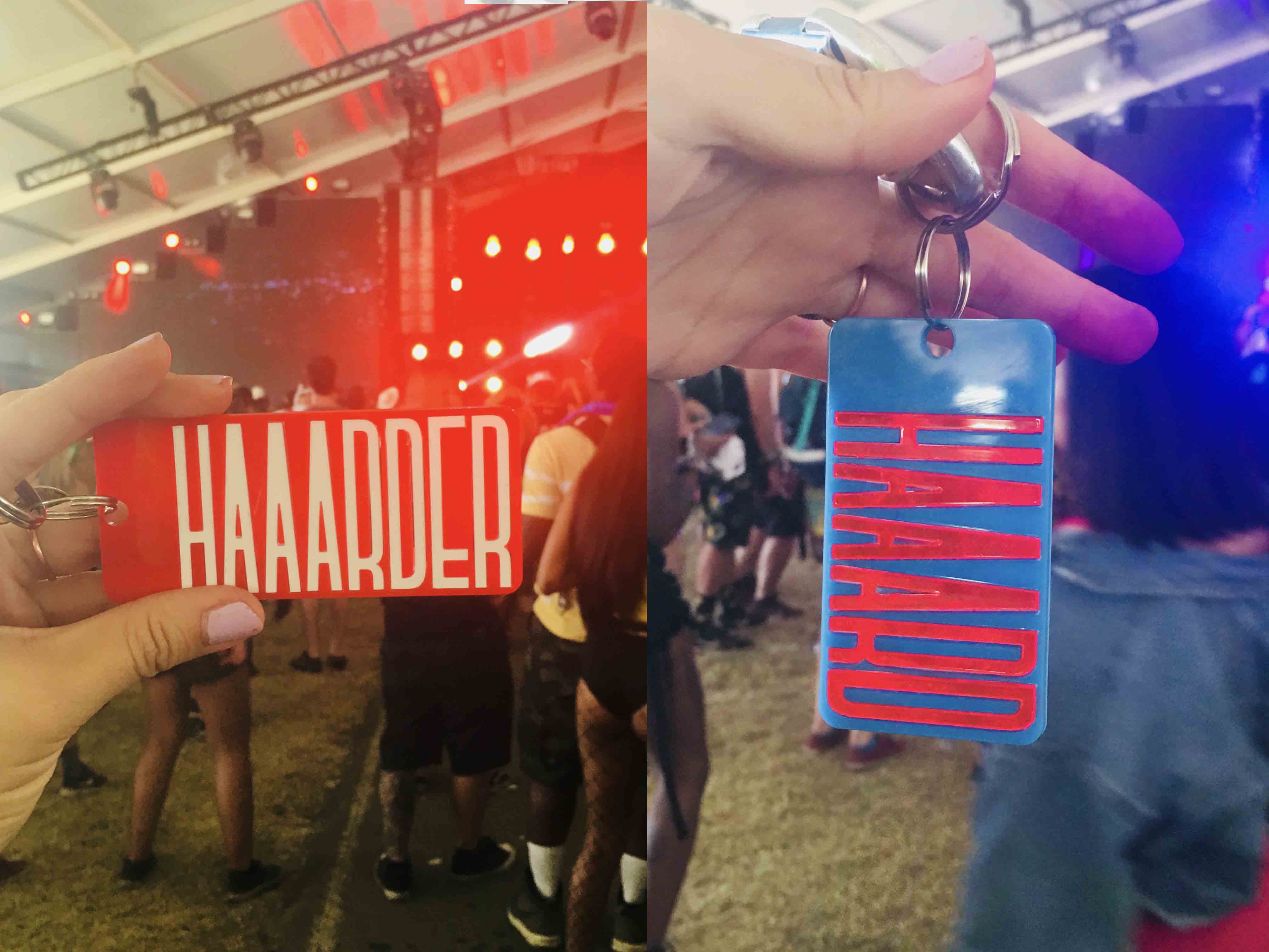
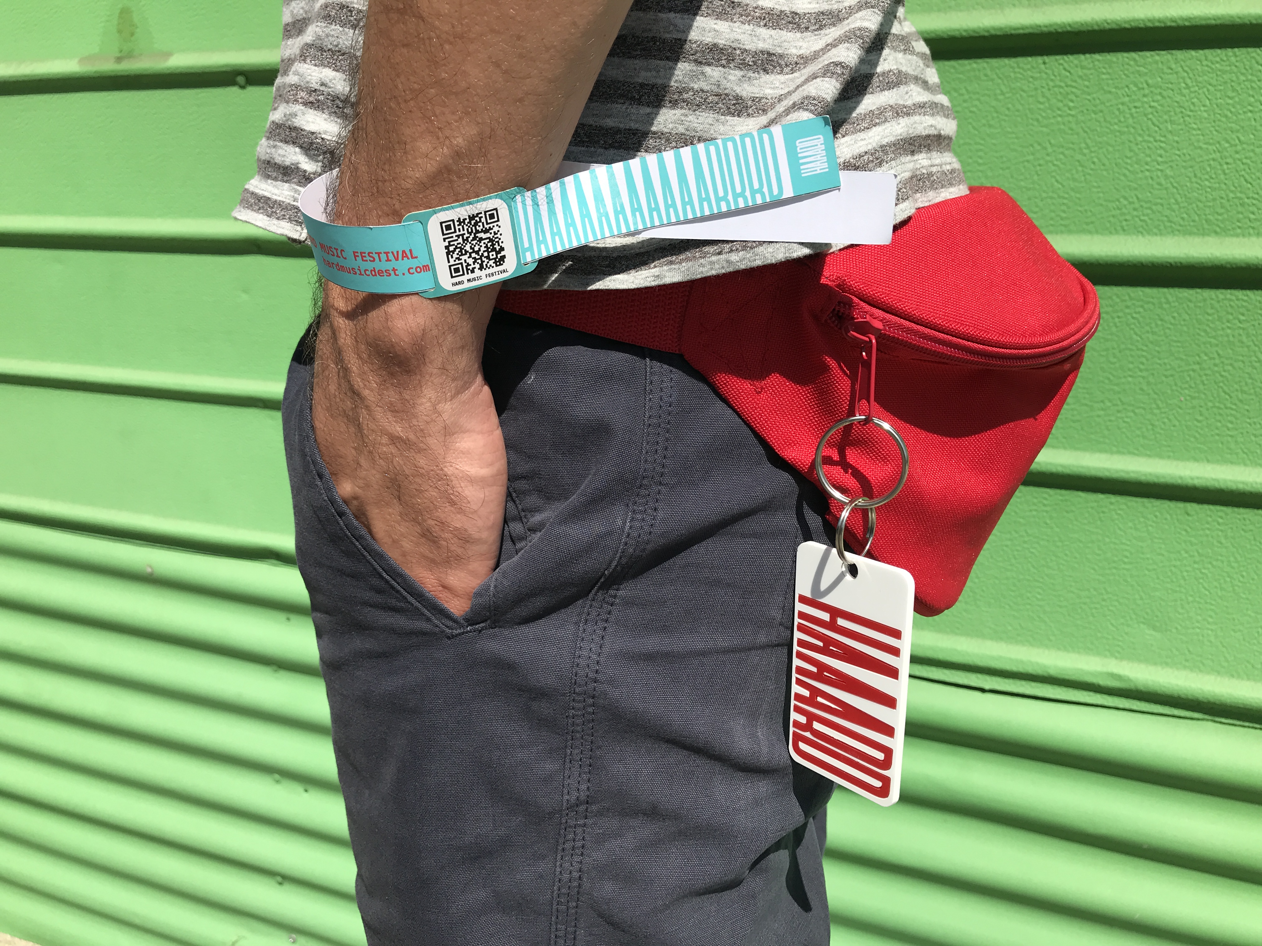
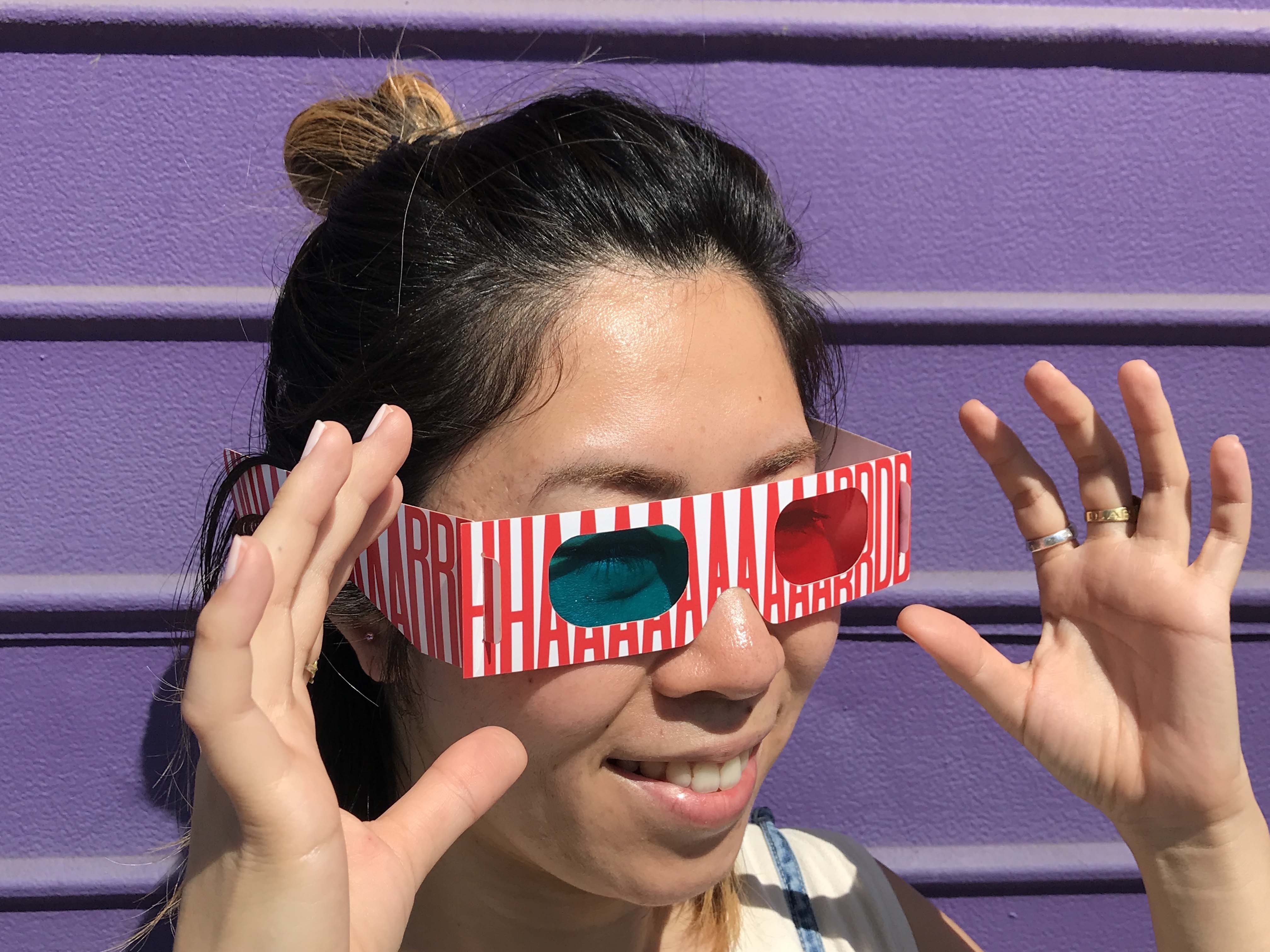
Sound Interactive HARD Font
The custom type system responds to the dynamic changes in sound, volume and rhythm inherent in
the festival environment.
Each letter-form has its own unique action and range of movements.
Each letter-form has its own unique action and range of movements.
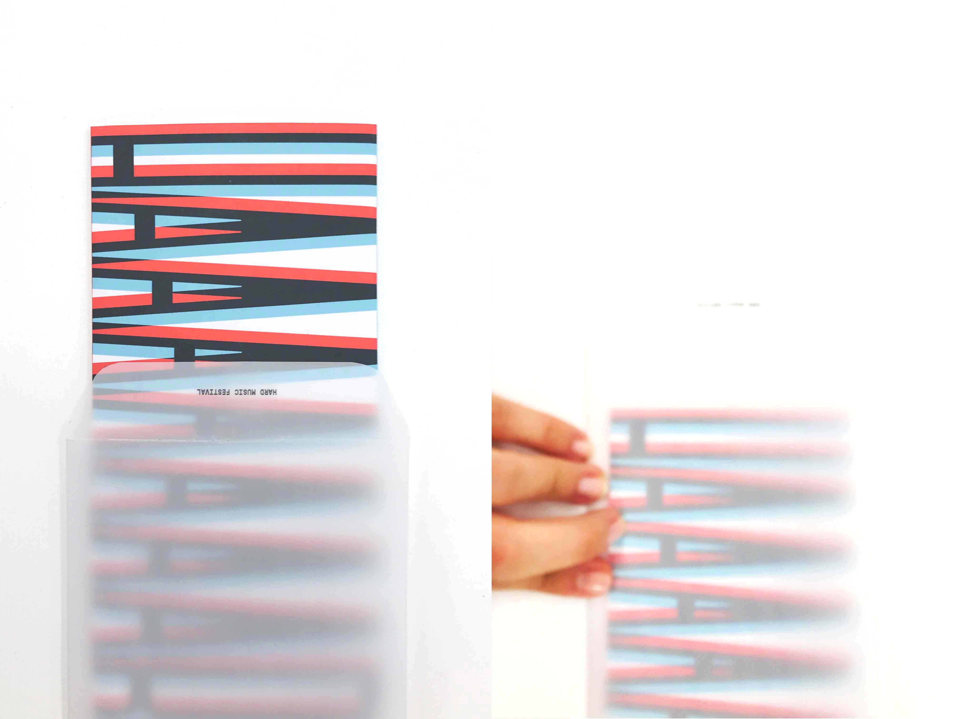


HARD Sound Space
HARD Sound Space is a music based interactive sculpture in the venue. Live and ambient sounds trigger the active projected content. This graphic language reflects and expands the festival’s new brand identity. The HARD Sound Space celebrates the interactive and immersive festival experience.
Top